Chapter 15 - Factors
library(forcats)
library(tidyverse)
15.3.1 Exercises
1. Explore the distribution of rincome (reported income). What makes the default bar chart hard to understand? How could you improve the plot?
We can explore the distribution either by looking at summary(gss_cat$rincome) or by plotting the data using geom_bar(). rincome is a column of factors divided in to several categories. From the summary we can see that most people who reported their income lie in the 25,000 or more category, but a lot of people did not answer the survey or were not applicable as well. The names of each category are fairly long, and in the default plot the labels are overlapping. To improve the default plot, we can tilt the axis labels so that they are readable using the theme() option in ggplot2.
summary(gss_cat$rincome)## No answer Don't know Refused $25000 or more $20000 - 24999
## 183 267 975 7363 1283
## $15000 - 19999 $10000 - 14999 $8000 to 9999 $7000 to 7999 $6000 to 6999
## 1048 1168 340 188 215
## $5000 to 5999 $4000 to 4999 $3000 to 3999 $1000 to 2999 Lt $1000
## 227 226 276 395 286
## Not applicable
## 7043ggplot(gss_cat, aes(rincome)) +
geom_bar() +
theme(axis.text.x = element_text(angle = 45, hjust = 1))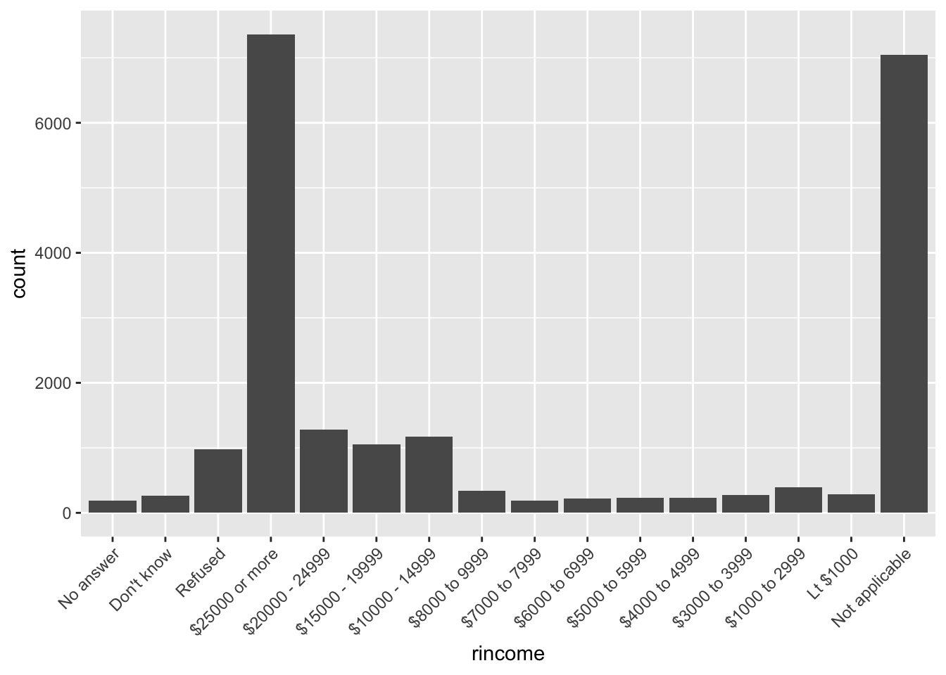
2. What is the most common relig in this survey? What’s the most common partyid?
Based on the bar plots, the most common relig in this survey is Protestant. The most common partyid is Independent.
ggplot(gss_cat, aes(relig)) +
  geom_bar() +
  theme(axis.text.x = element_text(angle = 45, hjust = 1))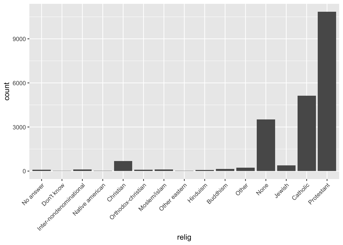
ggplot(gss_cat, aes(partyid)) +
  geom_bar() +
  theme(axis.text.x = element_text(angle = 45, hjust = 1))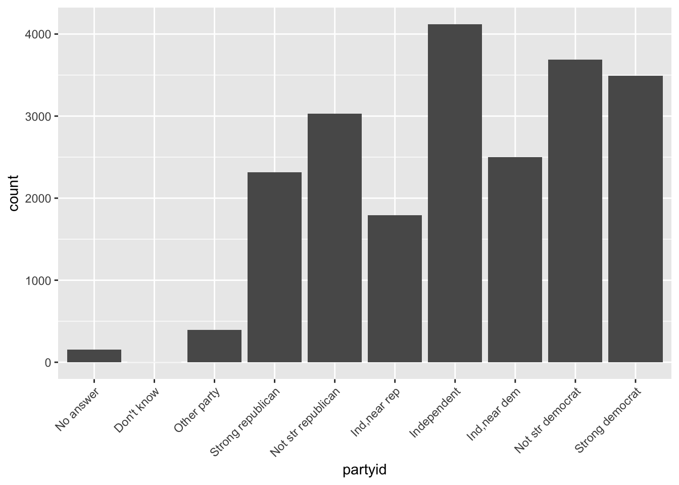
3. Which relig does denom (denomination) apply to? How can you find out with a table? How can you find out with a visualisation?
You can find out with a table by using dplyr commands, first grouping by denom, then finding the proportion of each religion within a denom. To find out with a visualization, you can use an aesthetic mapping in ggplot2 to fill in a barplot with colors based on the relig. To make the proportion easier to see, you can specify position = “fill”.
gss_cat %>%
  group_by (denom, relig) %>%
  count()
## # A tibble: 47 x 3
## # Groups: denom, relig [47]
## denom relig n
## <fct> <fct> <int>
## 1 No answer No answer 93
## 2 No answer Christian 2
## 3 No answer Protestant 22
## 4 Don't know Christian 11
## 5 Don't know Protestant 41
## 6 No denomination Christian 452
## 7 No denomination Other 7
## 8 No denomination Protestant 1224
## 9 Other Protestant 2534
## 10 Episcopal Protestant 397
## # … with 37 more rowsggplot(gss_cat, aes(denom)) +
geom_bar(aes(fill = relig)) +
theme(axis.text.x = element_text(angle = 45, hjust = 1))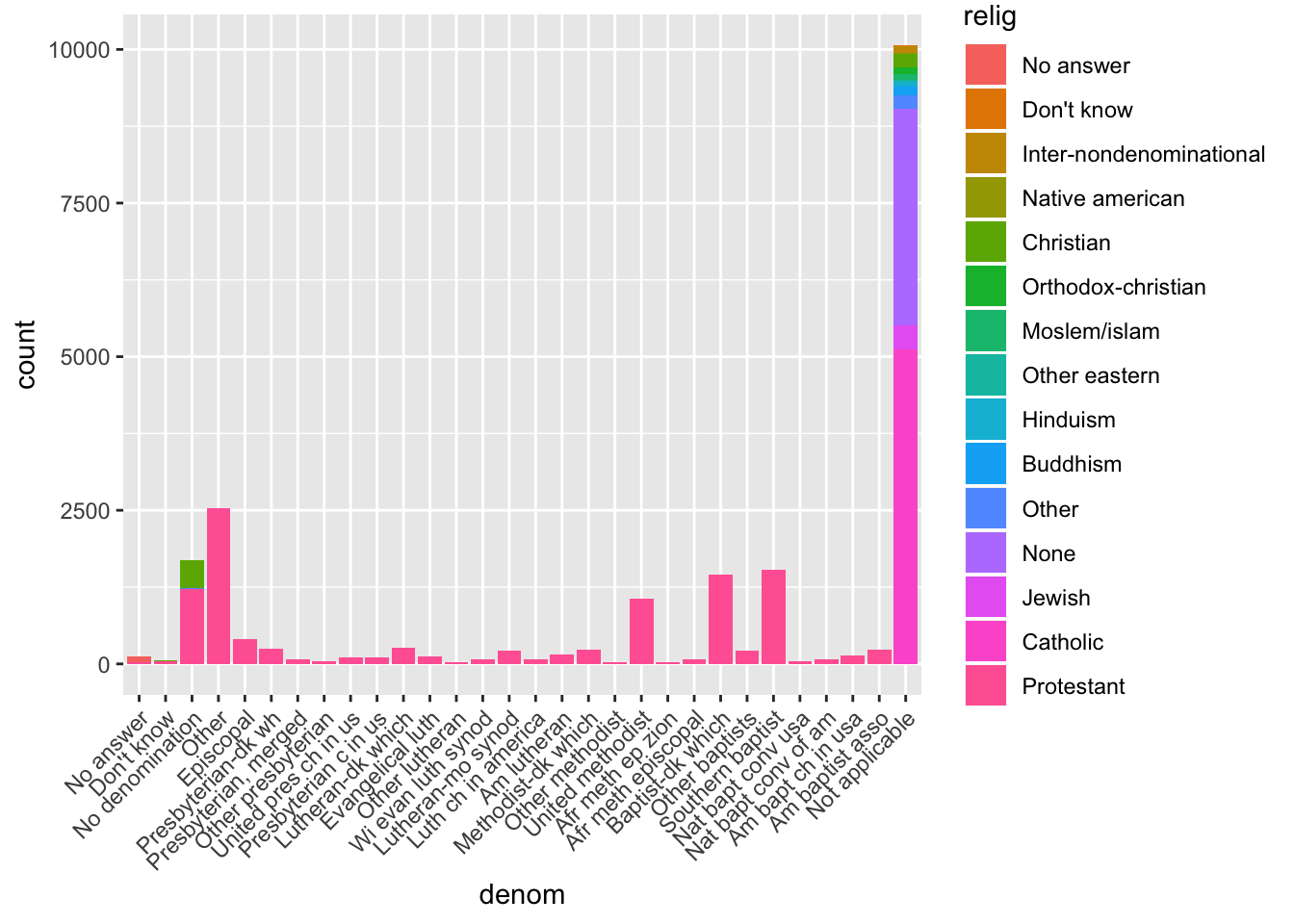
ggplot(gss_cat, aes(denom)) +
  geom_bar(aes(fill = relig), position = "fill") +
  theme(axis.text.x = element_text(angle = 45, hjust = 1))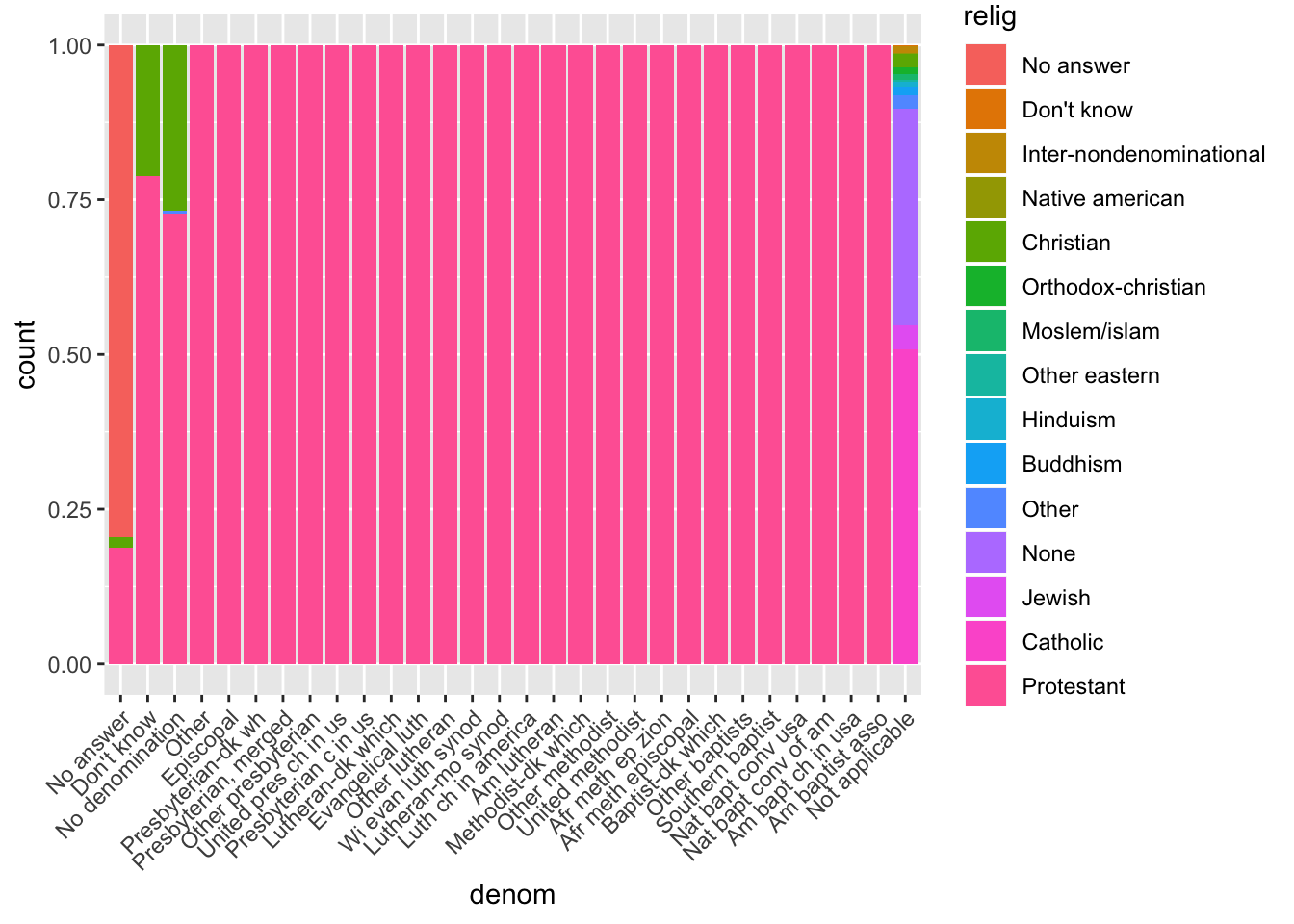
15.4.1 Exercises
1. There are some suspiciously high numbers in tvhours. Is the mean a good summary?
If there are very high outliers in any distribution, the mean will be inflated. Since the mean is the average of the numbers, any extremely high numbers will increase the mean. Therefore, the mean is not a good summary. In this instance, the median may give a better measure of where the data is centered. It is always a good idea to be aware of what types of outliers exist in your data. Plotting a histogram of tvhours below, we can see that in some cases there are over 20 hours of tv! The distribution is skewed to the right.
ggplot(gss_cat, aes (tvhours)) +
  geom_histogram()
## `stat_bin()` using `bins = 30`. Pick better value with `binwidth`.## Warning: Removed 10146 rows containing non-finite values (stat_bin).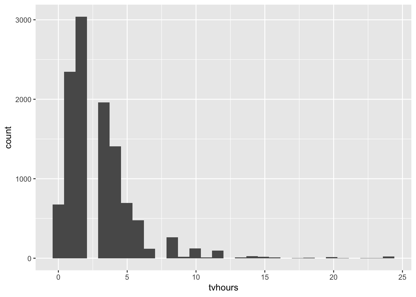
2. For each factor in gss_cat identify whether the order of the levels is arbitrary or principled.
We can determine this by examining the levels of each one of the factor columns in gss_cat using levels(), and then determining whether there is a principle to the ordering listed. Here is my assessment: marital - arbitrary, race - arbitrary, rincome - principled (based on decreasing income levels), partyid - principled (going from strong republican, slowly towards strong democrat), relig - arbitrary, denom - arbitrary.
levels(gss_cat$marital)## [1] "No answer" "Never married" "Separated" "Divorced"
## [5] "Widowed" "Married"levels(gss_cat$race)## [1] "Other" "Black" "White" "Not applicable"levels(gss_cat$rincome)## [1] "No answer" "Don't know" "Refused" "$25000 or more"
## [5] "$20000 - 24999" "$15000 - 19999" "$10000 - 14999" "$8000 to 9999"
## [9] "$7000 to 7999" "$6000 to 6999" "$5000 to 5999" "$4000 to 4999"
## [13] "$3000 to 3999" "$1000 to 2999" "Lt $1000" "Not applicable"levels(gss_cat$partyid)## [1] "No answer" "Don't know" "Other party"
## [4] "Strong republican" "Not str republican" "Ind,near rep"
## [7] "Independent" "Ind,near dem" "Not str democrat"
## [10] "Strong democrat"levels(gss_cat$relig)## [1] "No answer" "Don't know"
## [3] "Inter-nondenominational" "Native american"
## [5] "Christian" "Orthodox-christian"
## [7] "Moslem/islam" "Other eastern"
## [9] "Hinduism" "Buddhism"
## [11] "Other" "None"
## [13] "Jewish" "Catholic"
## [15] "Protestant" "Not applicable"levels(gss_cat$denom)## [1] "No answer" "Don't know" "No denomination"
## [4] "Other" "Episcopal" "Presbyterian-dk wh"
## [7] "Presbyterian, merged" "Other presbyterian" "United pres ch in us"
## [10] "Presbyterian c in us" "Lutheran-dk which" "Evangelical luth"
## [13] "Other lutheran" "Wi evan luth synod" "Lutheran-mo synod"
## [16] "Luth ch in america" "Am lutheran" "Methodist-dk which"
## [19] "Other methodist" "United methodist" "Afr meth ep zion"
## [22] "Afr meth episcopal" "Baptist-dk which" "Other baptists"
## [25] "Southern baptist" "Nat bapt conv usa" "Nat bapt conv of am"
## [28] "Am bapt ch in usa" "Am baptist asso" "Not applicable"3. Why did moving “Not applicable” to the front of the levels move it to the bottom of the plot?
In the text, the “after” argument was not specified, so the default value of after = OL was used, which puts “Not applicable” to the front. This results in it being placed before “No answer”. The way that geom_point() plots the categories is such that the first level is plotted at the bottom. This is why “Not applicable” appears at the bottom of the plot.
levels(gss_cat$rincome)## [1] "No answer" "Don't know" "Refused" "$25000 or more"
## [5] "$20000 - 24999" "$15000 - 19999" "$10000 - 14999" "$8000 to 9999"
## [9] "$7000 to 7999" "$6000 to 6999" "$5000 to 5999" "$4000 to 4999"
## [13] "$3000 to 3999" "$1000 to 2999" "Lt $1000" "Not applicable"levels(fct_relevel(gss_cat$rincome, "Not applicable"))## [1] "Not applicable" "No answer" "Don't know" "Refused"
## [5] "$25000 or more" "$20000 - 24999" "$15000 - 19999" "$10000 - 14999"
## [9] "$8000 to 9999" "$7000 to 7999" "$6000 to 6999" "$5000 to 5999"
## [13] "$4000 to 4999" "$3000 to 3999" "$1000 to 2999" "Lt $1000"15.5.1 Exercises
1. How have the proportions of people identifying as Democrat, Republican, and Independent changed over time?
To answer this, first lump together all the Democrat-associated categories into one category named “All Democrats”, and likewise for Republican and Independent. Then, we can plot the change in the number of people that associate with these categories over time.
gss_cat %>%
  mutate(partyid = fct_recode(partyid,
    "Republican"    = "Strong republican",
    "Republican"      = "Not str republican",
    "Independent" = "Ind,near rep",
    "Independent" = "Ind,near dem",
    "Democrat"        = "Not str democrat",
    "Democrat"      = "Strong democrat",
    "Other"                 = "No answer",
    "Other"                 = "Don't know",
    "Other"                 = "Other party"
  )) %>%
  ggplot(aes(x = year))+
  geom_bar(aes(fill = partyid))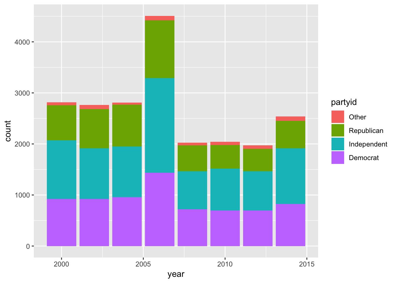
2. How could you collapse rincome into a small set of categories?
We could make the income-blocks larger, by combining the income categories into blocks of “less than 5000”, “5000 to 10000”, “10000 to 25000”, and “25000 or more”. We could also lump together “Refused”, “dont know”, “no answer”, and “not applicable” into an “other” category, although this may be dangerous. Some questions we might ask before lumping these groups together are: do people who refused to take the survey have behavioral differences that may matter in some contexts? Why did people not answer the survey–did they not have had the means to do so? Do these categories preferentially lie in specific districts?
gss_cat %>%
  mutate(rincome = fct_recode(rincome,
    "less than 5000"      = "Lt $1000",
    "less than 5000" = "$1000 to 2999",
    "less than 5000" = "$3000 to 3999",
    "less than 5000" = "$4000 to 4999",
    "5000 to 10000"  = "$5000 to 5999",
    "5000 to 10000"  = "$6000 to 6999",
    "5000 to 10000"  = "$7000 to 7999",
    "5000 to 10000"  = "$8000 to 9999",
    "10000 to 25000" = "$10000 - 14999",
    "10000 to 25000" = "$15000 - 19999",
    "10000 to 25000" = "$20000 - 24999",
    "Other" = "No answer",
    "Other" = "Don't know",
    "Other" = "Refused",
    "Other" = "Not applicable"
  )) %>%
  count(rincome)
## # A tibble: 5 x 2
## rincome n
## <fct> <int>
## 1 Other 8468
## 2 $25000 or more 7363
## 3 10000 to 25000 3499
## 4 5000 to 10000 970
## 5 less than 5000 1183