Chapter 24 - Model building
For this chapter, the following packages and modifications to datasets were used:
options(na.action = na.warn)
library(nycflights13)
library(lubridate)
diamonds2 <- diamonds %>%
filter(carat <= 2.5) %>%
mutate(lprice = log2(price), lcarat = log2(carat))24.2.3 Exercises
1. In the plot of lcarat vs. lprice, there are some bright vertical strips. What do they represent?
The color of each hexagon in geom_hex corresponds to the number of observations that lie within the hexagon, which means that the bright vertical strips represent highly concentrated areas containing large amounts of observations relative to the dim hexagons. Hadley alludes to the possible reason why these stripes exist in the previous chapters, where he mentions that humans are inclined to report “pretty” intervals such as 1.0, 1.5, 2.0, etc, resulting in more observations lying on these intervals.
ggplot(diamonds2, aes(lcarat, lprice)) +
  geom_hex(bins = 50)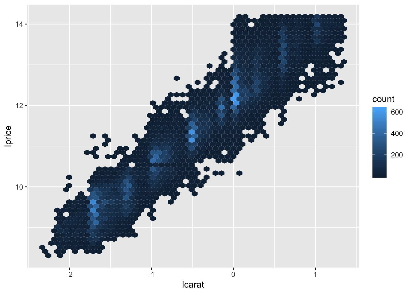
2. If log(price) = a_0 + a_1 * log(carat), what does that say about the relationship between price and carat?
This equation suggests that there is a linear relationsihp between log(price) and log(carat), because the equation can be interpreted as a_0 being an intercept and a_1 being a “slope”. It is harder to discern the relationship between the non-logged price and carat given this equation. The relationship between the original non-transformed variables may not necessarily be linear.
3. Extract the diamonds that have very high and very low residuals. Is there anything unusual about these diamonds? Are they particularly bad or good, or do you think these are pricing errors?
Hadley extracts the diamonds with high / low residuals (abs(lresid2) > 1) in the code below. After examining these, we find that most of the outlier diamonds that are priced much lower than predicted have a specific flaw associated with them. For example, $1262 predicted to be $2644 has a huge carat size but has a clarity of I1 (worst clarity), of which there are not that many observations for in the dataset (707 observations for grade I1 vs 13055 observations for grade SI1).
The diamonds in this list usually have a combination of very good qualities as well as very bad qualities. It could be that there is some multicollinearity in the model, in which some of the predictor variables (lcarat, color, cut, and clarity) are correlated with one another. This may result in the model breaking down when something when the values of two variables which usually are correlated do not follow the trend for any specific observation. For example, the diamond priced at 2366 is predicted to only be 774, but this is likely due to the fact that the diamond has one of the best clarity values, but has the worst possible color. Looking at a density plot of color vs clarity, we find that there are very few observations which have this combination of color and clarity, which may be why the model breaks down.
mod_diamond2 <- lm(lprice ~ lcarat + color + cut + clarity, data = diamonds2)

diamonds2 <- diamonds2 %>%
  add_residuals(mod_diamond2, "lresid2")

ggplot(diamonds2, aes(lcarat, lresid2)) +
  geom_hex(bins = 50)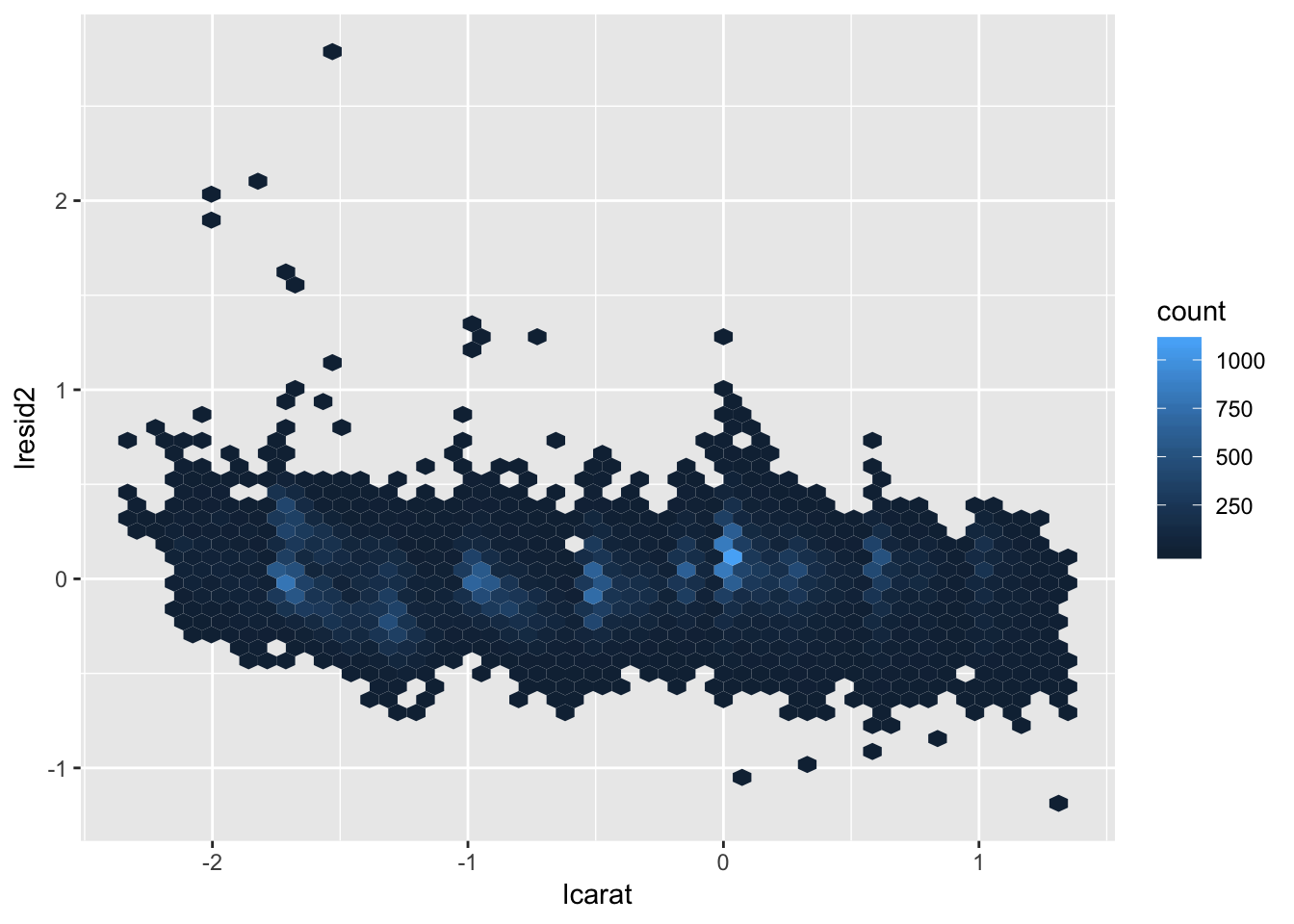
diamonds2 %>%
  filter(abs(lresid2) > 1) %>%
  add_predictions(mod_diamond2) %>%
  mutate(pred = round(2 ^ pred)) %>%
  select(price, pred, carat:table, x:z, lresid2) %>%
  arrange(price)
## # A tibble: 16 x 12
## price pred carat cut color clarity depth table x y z
## <int> <dbl> <dbl> <ord> <ord> <ord> <dbl> <dbl> <dbl> <dbl> <dbl>
## 1 1013 264 0.25 Fair F SI2 54.4 64 4.3 4.23 2.32
## 2 1186 284 0.25 Prem… G SI2 59 60 5.33 5.28 3.12
## 3 1186 284 0.25 Prem… G SI2 58.8 60 5.33 5.28 3.12
## 4 1262 2644 1.03 Fair E I1 78.2 54 5.72 5.59 4.42
## 5 1415 639 0.35 Fair G VS2 65.9 54 5.57 5.53 3.66
## 6 1415 639 0.35 Fair G VS2 65.9 54 5.57 5.53 3.66
## 7 1715 576 0.32 Fair F VS2 59.6 60 4.42 4.34 2.61
## 8 1776 412 0.290 Fair F SI1 55.8 60 4.48 4.41 2.48
## 9 2160 314 0.34 Fair F I1 55.8 62 4.72 4.6 2.6
## 10 2366 774 0.3 Very… D VVS2 60.6 58 4.33 4.35 2.63
## 11 3360 1373 0.51 Prem… F SI1 62.7 62 5.09 4.96 3.15
## 12 3807 1540 0.61 Good F SI2 62.5 65 5.36 5.29 3.33
## 13 3920 1705 0.51 Fair F VVS2 65.4 60 4.98 4.9 3.23
## 14 4368 1705 0.51 Fair F VVS2 60.7 66 5.21 5.11 3.13
## 15 10011 4048 1.01 Fair D SI2 64.6 58 6.25 6.2 4.02
## 16 10470 23622 2.46 Prem… E SI2 59.7 59 8.82 8.76 5.25
## # … with 1 more variable: lresid2 <dbl>diamonds2 %>% group_by(clarity) %>% summarize (num = n())## # A tibble: 8 x 2
## clarity num
## <ord> <int>
## 1 I1 707
## 2 SI2 9116
## 3 SI1 13055
## 4 VS2 12256
## 5 VS1 8169
## 6 VVS2 5066
## 7 VVS1 3655
## 8 IF 1790diamonds2 %>% ggplot(aes(color, clarity))+
geom_bin2d()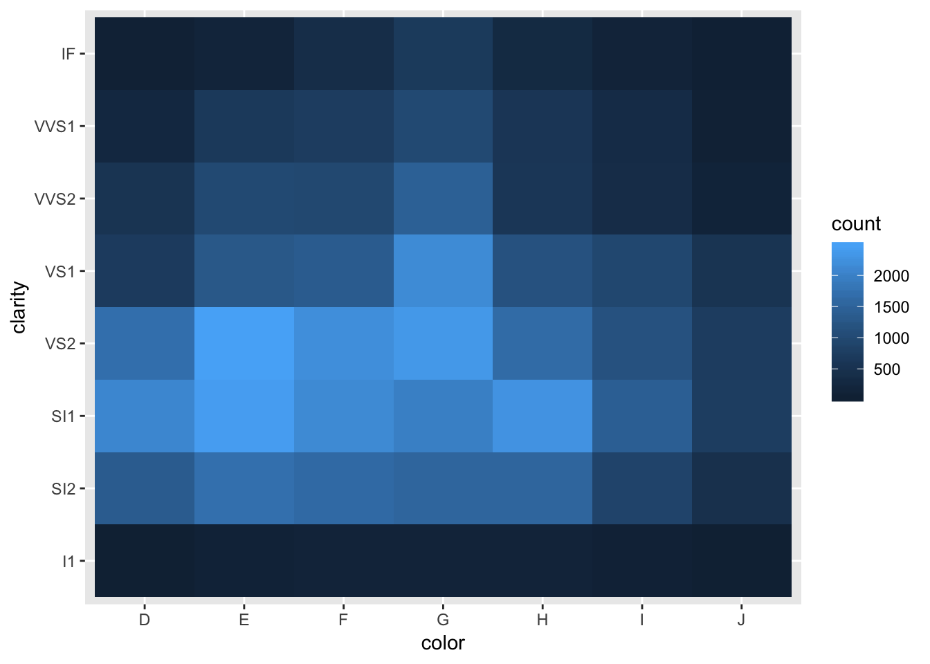
4. Does the final model, mod_diamond2, do a good job of predicting diamond prices? Would you trust it to tell you how much to spend if you were buying a diamond?
Judging by the plot of the residuals, the model does a decent job at removing the patterns in the data (fairly flat, only a handful of residuals > 1 st. deviation away from 0) for the log-transformed version of the data. The model could be improved to reduce the variance of the residuals (compress the points toward h=0), in order to get more accurate predictions. However, since we aren’t dealing with log-transformed money when buying diamonds in the real world, we should examine how the residuals look when transformed back into their true values. To do so, we calculate subtract the non-logged prediction value from the true value to get the non-transformed residual. Plotting these non-transformed residuals shows that the variability in residuals increases as carat increases (same is true for lcarat). I would have moderate faith in the model for diamonds less than 1 carat, but for diamonds greater than one carat, I would be cautious. The model would be useful to determine whether you were being completely scammed, but it may not be that good for determining small variations in price.
nontransformed_residual <- diamonds2 %>%
    filter(abs(lresid2) < 1) %>%
    add_predictions(mod_diamond2) %>%
    mutate(pred = round(2 ^ pred)) %>%
    mutate(resid = price - pred)

nontransformed_residual %>% ggplot( aes (carat, resid) )+
  geom_hex()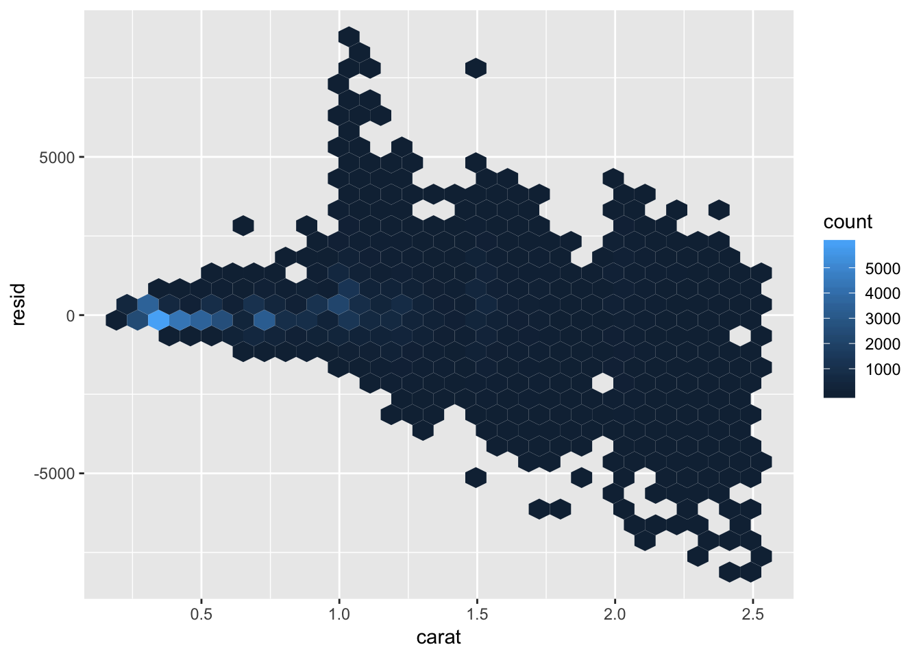
nontransformed_residual %>%
  summarize (resid_mean = mean(resid),
             resid_sd = sd(resid),
             resid_interval_low = mean(resid) - 1.96* sd(resid),
             resid_interval_high = mean(resid) + 1.96* sd(resid),
             limit_upper = max(resid),
             limit_lower = min(resid),
             maxprice = max(price),
             minprice = min(price))
## # A tibble: 1 x 8
## resid_mean resid_sd resid_interval_… resid_interval_… limit_upper
## <dbl> <dbl> <dbl> <dbl> <dbl>
## 1 49.0 731. -1385. 1483. 8994
## # … with 3 more variables: limit_lower <dbl>, maxprice <dbl>,
## # minprice <dbl>24.3.5 Exercises
daily <- flights %>%
  mutate(date = make_date(year, month, day)) %>%
  group_by(date) %>%
  summarise(n = n())
daily
## # A tibble: 365 x 2
## date n
## <date> <int>
## 1 2013-01-01 842
## 2 2013-01-02 943
## 3 2013-01-03 914
## 4 2013-01-04 915
## 5 2013-01-05 720
## 6 2013-01-06 832
## 7 2013-01-07 933
## 8 2013-01-08 899
## 9 2013-01-09 902
## 10 2013-01-10 932
## # … with 355 more rowsggplot(daily, aes(date, n)) +
geom_line()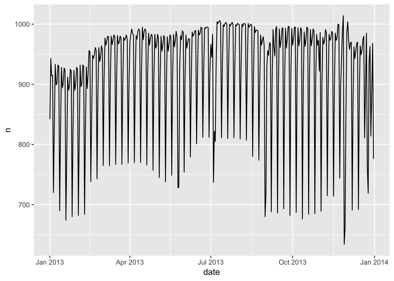
daily <- daily %>%
  mutate(wday = wday(date, label = TRUE))
mod <- lm(n ~ wday, data = daily)

daily <- daily %>%
  add_residuals(mod)
daily %>%
  ggplot(aes(date, resid)) +
  geom_ref_line(h = 0) +
  geom_line()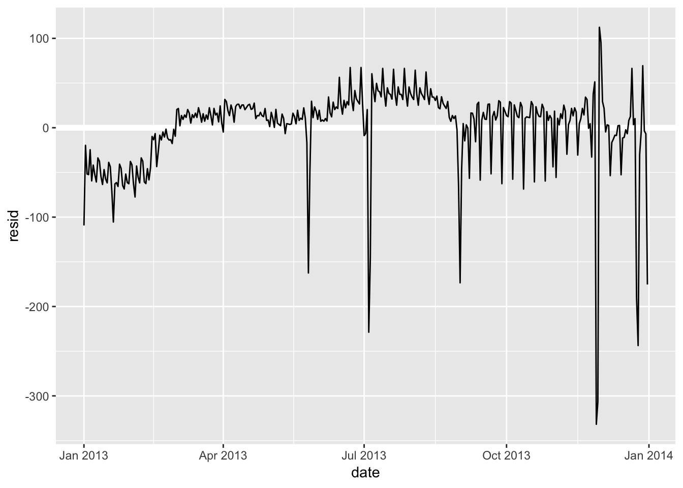
term <- function(date) {
  cut(date,
    breaks = ymd(20130101, 20130605, 20130825, 20140101),
    labels = c("spring", "summer", "fall")
  )
}

daily <- daily %>%
  mutate(term = term(date))
1. Use your Google sleuthing skills to brainstorm why there were fewer than expected flights on Jan 20, May 26, and Sep 1. (Hint: they all have the same explanation.) How would these days generalise to another year?
These days are all the day before major US holidays (Sep 2, 2013 is Labor Day) which fall exclusively on Mondays. There may be fewer than expected flights due to the extended weekend / other holiday-associated factors. For another year, these days can be found by looking for the day before the third Monday in January, fourth Monday in May, and first Monday in September.
2. What do the three days with high positive residuals represent? How would these days generalise to another year?
These days look like are also associated with major US holidays, with 11/30/2013 and 12/01/2013 being the weekend after Thanksgiving, and 12/28/2013 being the weekend after Christmas. The reason flights peak on these days may be due to families who had visited their relatives leaving to go back home. These can be generalized to another year by looking for the weekends after these holidays, which typically fall after the 4th week of November and December.
daily %>%
  top_n(3, resid)
## # A tibble: 3 x 5
## date n wday resid term
## <date> <int> <ord> <dbl> <fct>
## 1 2013-11-30 857 Sat 112. fall
## 2 2013-12-01 987 Sun 95.5 fall
## 3 2013-12-28 814 Sat 69.4 fall3. Create a new variable that splits the wday variable into terms, but only for Saturdays, i.e. it should have Thurs, Fri, but Sat-summer, Sat-spring, Sat-fall. How does this model compare with the model with every combination of wday and term?
In order to split the saturdays into terms, I wrote an annotate_sat() function that takes the wday column and term column from daily and applies the appropriate suffix to each “Sat”. Fitting this model (mod3) and comparing it to the mod1 and mod2 described in the chapter shows that there is a slight improvement from mod 1 (no term variable), but that the model does slightly worse than mod2 (each day is termed). The RMSE is midway between mod1 and mod2.
annotate_sat <- function (wday, term) {
  index <- which (wday == "Sat")
  wday <- as.character(wday)
  wday[index] <- str_c("Sat-", as.character(term)[index])
  wday
}

daily <- daily %>% mutate (wday_sat = annotate_sat(wday,term))
daily
## # A tibble: 365 x 6
## date n wday resid term wday_sat
## <date> <int> <ord> <dbl> <fct> <chr>
## 1 2013-01-01 842 Tue -109. spring Tue
## 2 2013-01-02 943 Wed -19.7 spring Wed
## 3 2013-01-03 914 Thu -51.8 spring Thu
## 4 2013-01-04 915 Fri -52.5 spring Fri
## 5 2013-01-05 720 Sat -24.6 spring Sat-spring
## 6 2013-01-06 832 Sun -59.5 spring Sun
## 7 2013-01-07 933 Mon -41.8 spring Mon
## 8 2013-01-08 899 Tue -52.4 spring Tue
## 9 2013-01-09 902 Wed -60.7 spring Wed
## 10 2013-01-10 932 Thu -33.8 spring Thu
## # … with 355 more rowsmod1 <- lm(n ~ wday, data = daily)
mod2 <- lm(n ~ wday * term, data = daily)
mod3 <- lm(n ~ wday_sat, data = daily)
daily %>%
gather_residuals(no_term = mod1, all_cominbations = mod2, only_sat_term = mod3) %>%
ggplot(aes(date, resid, colour = model)) +
geom_line(alpha = 0.75)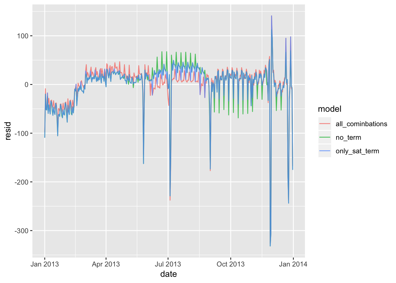
sigma(mod1)## [1] 48.79656sigma(mod2)## [1] 46.16568sigma(mod3)## [1] 47.359694. Create a new wday variable that combines the day of week, term (for Saturdays), and public holidays. What do the residuals of that model look like?
The code below adds a column to the data frame that indicates which days are holidays (I’ve chosen the main US corporate holidays for 2013). Fitting a model to this results in an rmse value that is lower than the model in which only the saturdays are termed (goes down from 47.36 to 42.94), suggesting that we are doing at least a slightly better job. Looking at the graph, the residuals that spike along the holidays are smaller (but still quite visible). There could be more ways to optimize the model to minimize these residuals, suchs as annotating wday with the few days before/after each holiday.
daily## # A tibble: 365 x 6
## date n wday resid term wday_sat
## <date> <int> <ord> <dbl> <fct> <chr>
## 1 2013-01-01 842 Tue -109. spring Tue
## 2 2013-01-02 943 Wed -19.7 spring Wed
## 3 2013-01-03 914 Thu -51.8 spring Thu
## 4 2013-01-04 915 Fri -52.5 spring Fri
## 5 2013-01-05 720 Sat -24.6 spring Sat-spring
## 6 2013-01-06 832 Sun -59.5 spring Sun
## 7 2013-01-07 933 Mon -41.8 spring Mon
## 8 2013-01-08 899 Tue -52.4 spring Tue
## 9 2013-01-09 902 Wed -60.7 spring Wed
## 10 2013-01-10 932 Thu -33.8 spring Thu
## # … with 355 more rowsannotate_sat_holiday <- function (date, wday, term) {
index <- which (wday == "Sat")
wday <- as.character(wday)
wday[index] <- str_c("Sat-", as.character(term)[index])
holidays <- ymd(20130101, 20130527, 20130704, 20130902, 20131111, 20131128, 20131225)
holday_index <- which (date %in% holidays)
wday[which (date %in% holidays)] <- "holiday"
wday
}
daily <- daily %>% mutate( wday_sat_holiday = annotate_sat_holiday(date,wday,term))
daily## # A tibble: 365 x 7
## date n wday resid term wday_sat wday_sat_holiday
## <date> <int> <ord> <dbl> <fct> <chr> <chr>
## 1 2013-01-01 842 Tue -109. spring Tue holiday
## 2 2013-01-02 943 Wed -19.7 spring Wed Wed
## 3 2013-01-03 914 Thu -51.8 spring Thu Thu
## 4 2013-01-04 915 Fri -52.5 spring Fri Fri
## 5 2013-01-05 720 Sat -24.6 spring Sat-spring Sat-spring
## 6 2013-01-06 832 Sun -59.5 spring Sun Sun
## 7 2013-01-07 933 Mon -41.8 spring Mon Mon
## 8 2013-01-08 899 Tue -52.4 spring Tue Tue
## 9 2013-01-09 902 Wed -60.7 spring Wed Wed
## 10 2013-01-10 932 Thu -33.8 spring Thu Thu
## # … with 355 more rowsmod4 <- lm(n ~ wday_sat_holiday, data = daily)
daily %>%
gather_residuals(only_sat_term = mod3, sat_with_holiday = mod4) %>%
ggplot(aes(date, resid, colour = model)) +
geom_line(alpha = 0.75)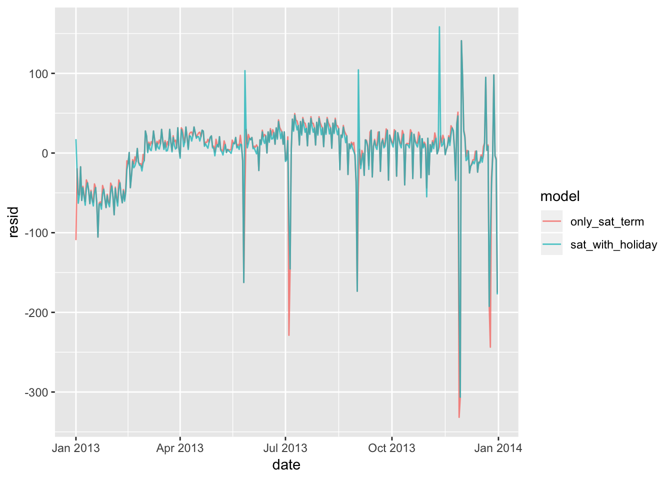
sigma(mod3)## [1] 47.35969sigma(mod4)## [1] 42.944945. What happens if you fit a day of week effect that varies by month (i.e. n ~ wday * month)? Why is this not very helpful?
Adding the month variable to the model reduces the values of the residuals by a small amount (and subsequently, the rmse). I would say that it is slightly helpful to include. I can see why it is not extremely helpful, because it may be over-fitting the data, as there is not necessarily a good reason to assume that each individual month is associated with their own unique day-of-the-week trends. This adds a large amount of predictor variables to the model that are not all necessarily independent from each other.
# add month column to daily
daily <- daily %>% mutate(month = factor(month(date)))
daily
## # A tibble: 365 x 8
## date n wday resid term wday_sat wday_sat_holiday month
## <date> <int> <ord> <dbl> <fct> <chr> <chr> <fct>
## 1 2013-01-01 842 Tue -109. spring Tue holiday 1
## 2 2013-01-02 943 Wed -19.7 spring Wed Wed 1
## 3 2013-01-03 914 Thu -51.8 spring Thu Thu 1
## 4 2013-01-04 915 Fri -52.5 spring Fri Fri 1
## 5 2013-01-05 720 Sat -24.6 spring Sat-spring Sat-spring 1
## 6 2013-01-06 832 Sun -59.5 spring Sun Sun 1
## 7 2013-01-07 933 Mon -41.8 spring Mon Mon 1
## 8 2013-01-08 899 Tue -52.4 spring Tue Tue 1
## 9 2013-01-09 902 Wed -60.7 spring Wed Wed 1
## 10 2013-01-10 932 Thu -33.8 spring Thu Thu 1
## # … with 355 more rowsmod5 <- lm(n ~ wday*month, data = daily)
daily %>%
gather_residuals(original_model = mod1, with_month = mod5) %>%
ggplot(aes(date, resid, colour = model)) +
geom_line(alpha = 0.75)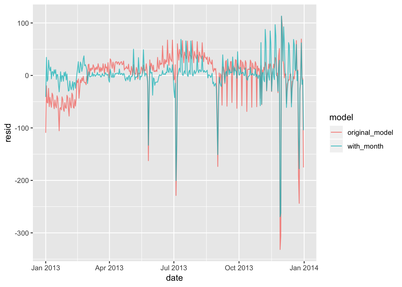
#summary(mod5)
sigma(mod1)
## [1] 48.79656sigma(mod5)## [1] 42.04896. What would you expect the model n ~ wday + ns(date, 5) to look like? Knowing what you know about the data, why would you expect it to be not particularly effective?
The book displays what the model n ~ wday * ns(date, 5) looks like, which factors in the relationship between wday and the time of year into the model. The model n ~ wday + ns(date, 5) uses the “+” operator instead of “*”, which means that this model does not account for the relationship between these two variables. I would expect that n ~ wday + ns(date, 5) does a worse job as a predictive model. Testing this out below, we see that the residuals are indeed larger. The number of predictor variables are also much fewer.
library(splines)
mod6 <- MASS::rlm(n ~ wday * ns(date, 5), data = daily)
mod7 <- MASS::rlm(n ~ wday + ns(date, 5), data = daily)

summary(mod6)
##
## Call: rlm(formula = n ~ wday * ns(date, 5), data = daily)
## Residuals:
## Min 1Q Median 3Q Max
## -339.23 -8.00 1.33 6.94 119.10
##
## Coefficients:
## Value Std. Error t value
## (Intercept) 839.1368 3.2049 261.8314
## wday.L -58.0966 8.7636 -6.6293
## wday.Q -177.5614 8.4931 -20.9065
## wday.C -76.1745 8.5575 -8.9015
## wday^4 -106.5457 8.6304 -12.3454
## wday^5 14.7852 8.3463 1.7715
## wday^6 -18.4661 8.0673 -2.2890
## ns(date, 5)1 90.3704 4.0032 22.5743
## ns(date, 5)2 133.7194 5.1333 26.0493
## ns(date, 5)3 41.3817 3.9584 10.4542
## ns(date, 5)4 180.6645 8.1033 22.2952
## ns(date, 5)5 28.9177 3.5076 8.2443
## wday.L:ns(date, 5)1 -35.0805 10.6922 -3.2809
## wday.Q:ns(date, 5)1 11.6486 10.5964 1.0993
## wday.C:ns(date, 5)1 -6.8751 10.6179 -0.6475
## wday^4:ns(date, 5)1 23.7107 10.6477 2.2268
## wday^5:ns(date, 5)1 -21.0685 10.5431 -1.9983
## wday^6:ns(date, 5)1 6.6103 10.4507 0.6325
## wday.L:ns(date, 5)2 19.8440 13.8192 1.4360
## wday.Q:ns(date, 5)2 66.9609 13.5972 4.9246
## wday.C:ns(date, 5)2 54.5911 13.6393 4.0025
## wday^4:ns(date, 5)2 59.4655 13.7181 4.3348
## wday^5:ns(date, 5)2 -21.2690 13.4571 -1.5805
## wday^6:ns(date, 5)2 8.7439 13.2506 0.6599
## wday.L:ns(date, 5)3 -104.5352 10.4834 -9.9715
## wday.Q:ns(date, 5)3 -83.6926 10.4858 -7.9815
## wday.C:ns(date, 5)3 -77.0187 10.4500 -7.3702
## wday^4:ns(date, 5)3 -36.3447 10.5211 -3.4545
## wday^5:ns(date, 5)3 -25.0391 10.4165 -2.4038
## wday^6:ns(date, 5)3 0.8459 10.4801 0.0807
## wday.L:ns(date, 5)4 -29.5596 22.0451 -1.3409
## wday.Q:ns(date, 5)4 58.6436 21.4762 2.7306
## wday.C:ns(date, 5)4 32.5922 21.5929 1.5094
## wday^4:ns(date, 5)4 61.0040 21.7796 2.8010
## wday^5:ns(date, 5)4 -41.3648 21.1311 -1.9575
## wday^6:ns(date, 5)4 13.1682 20.5795 0.6399
## wday.L:ns(date, 5)5 39.3654 9.1661 4.2947
## wday.Q:ns(date, 5)5 59.7652 9.3101 6.4194
## wday.C:ns(date, 5)5 39.0233 9.1742 4.2536
## wday^4:ns(date, 5)5 22.0797 9.3456 2.3626
## wday^5:ns(date, 5)5 2.1498 9.1824 0.2341
## wday^6:ns(date, 5)5 -4.9030 9.4987 -0.5162
##
## Residual standard error: 10.69 on 323 degrees of freedomsummary(mod7)##
## Call: rlm(formula = n ~ wday + ns(date, 5), data = daily)
## Residuals:
## Min 1Q Median 3Q Max
## -339.2832 -8.1235 0.1509 9.3763 111.5557
##
## Coefficients:
## Value Std. Error t value
## (Intercept) 843.7636 3.5622 236.8666
## wday.L -80.1706 2.1137 -37.9291
## wday.Q -156.9939 2.1125 -74.3180
## wday.C -68.1163 2.1111 -32.2664
## wday^4 -78.8676 2.1143 -37.3026
## wday^5 -6.3087 2.1084 -2.9922
## wday^6 -11.5275 2.1095 -5.4646
## ns(date, 5)1 87.4028 4.4681 19.5615
## ns(date, 5)2 121.4169 5.7198 21.2276
## ns(date, 5)3 53.7103 4.4159 12.1630
## ns(date, 5)4 169.0229 9.0113 18.7567
## ns(date, 5)5 18.4859 3.9036 4.7356
##
## Residual standard error: 13.24 on 353 degrees of freedomdaily %>%
gather_residuals(multiplicative_splines = mod6, additive_splines = mod7) %>%
ggplot(aes(date, resid, colour = model)) +
geom_line(alpha = 0.75)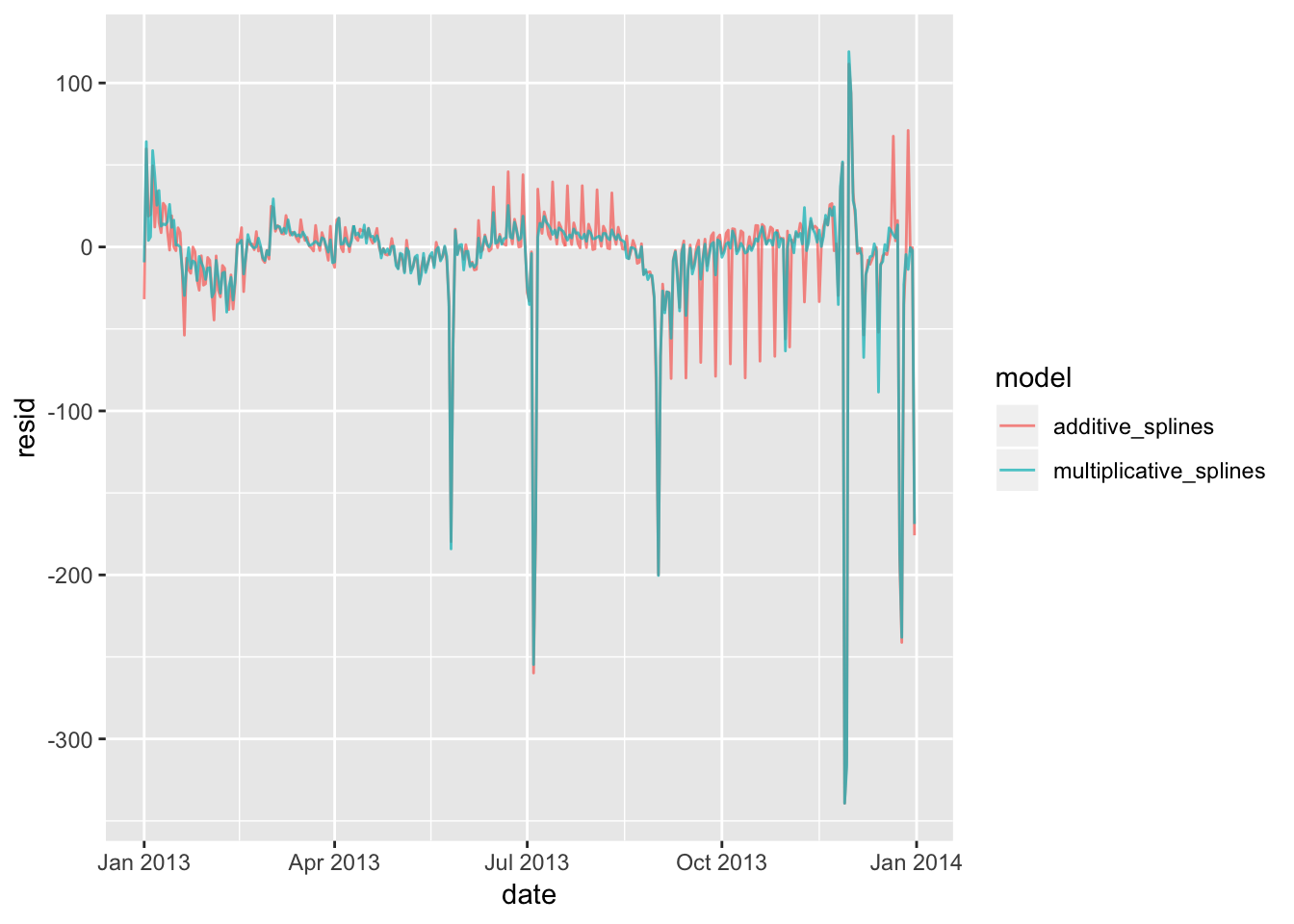
sigma(mod6)## [1] 43.92417sigma(mod7)## [1] 44.301977. We hypothesised that people leaving on Sundays are more likely to be business travellers who need to be somewhere on Monday. Explore that hypothesis by seeing how it breaks down based on distance and time: if it’s true, you’d expect to see more Sunday evening flights to places that are far away.
To explore this hypothesis, we first generate a new data frame from flights that contains a factor splitting up each day into early morning (12am-8am, 8am-12pm, 12pm-5pm, and 5pm-12am). We can then summarize the data to obtain the mean distance of flights that occurred during each of those intervals grouped by day. Plotting this using boxplots, we observe that flights taking off between 1am and 8am on Sundays have a much higher mean distance compared to all other categories. Contrary to our hypothesis that evening flights (5pm-12am) would be the longest distance-wise, we instead see that there are more Sunday early morning flights between 12am-8am.
# add distance and time of flight to daily matrix
timeofday <- function(date) {
  cut(date,
    breaks = c(0,7, 12, 17, 23),
    labels = c("12am-8am", "8am-12pm", "12pm-5pm","5pm-12am")
  )
}

flights2 <- flights %>% mutate (date = make_date (year, month, day), timeofday = timeofday(hour)) %>%
  group_by(date, timeofday) %>%
  summarize (n = n(),
             mean_dist = mean(distance)) %>%
  mutate(wday = wday(date, label = TRUE))

flights2
## # A tibble: 1,460 x 5
## # Groups: date [365]
## date timeofday n mean_dist wday
## <date> <fct> <int> <dbl> <ord>
## 1 2013-01-01 12am-8am 107 1234. Tue
## 2 2013-01-01 8am-12pm 246 1074. Tue
## 3 2013-01-01 12pm-5pm 301 1040. Tue
## 4 2013-01-01 5pm-12am 188 1051. Tue
## 5 2013-01-02 12am-8am 146 1132. Wed
## 6 2013-01-02 8am-12pm 274 1045. Wed
## 7 2013-01-02 12pm-5pm 318 1023. Wed
## 8 2013-01-02 5pm-12am 205 1054. Wed
## 9 2013-01-03 12am-8am 144 1118. Thu
## 10 2013-01-03 8am-12pm 262 1037. Thu
## # … with 1,450 more rowsggplot(flights2, aes (x = wday, y = mean_dist))+
geom_boxplot(aes(color = timeofday))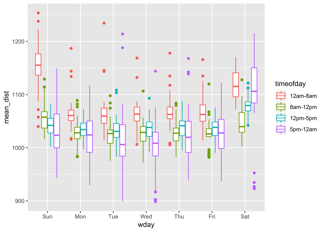
#
# flights %>% mutate (date = make_date (year, month, day), timeofday = timeofday(hour)) %>%
# mutate(wday = wday(date, label = TRUE))%>%
# ggplot( aes (x = wday, y = distance))+
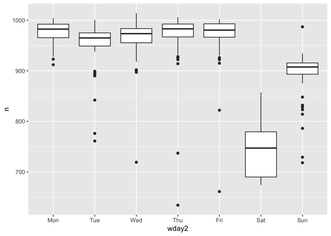
# geom_boxplot(aes(color = timeofday))8. It’s a little frustrating that Sunday and Saturday are on separate ends of the plot. Write a small function to set the levels of the factor so that the week starts on Monday.
The levels of a factor can be re-ordered using the factor() function and redefining the order of the levels by manually passing them into the levels argument. Below is an example of a function reordering the factors so that the week starts on monday.
# before reordering the factors
ggplot(daily, aes(wday, n)) +
  geom_boxplot()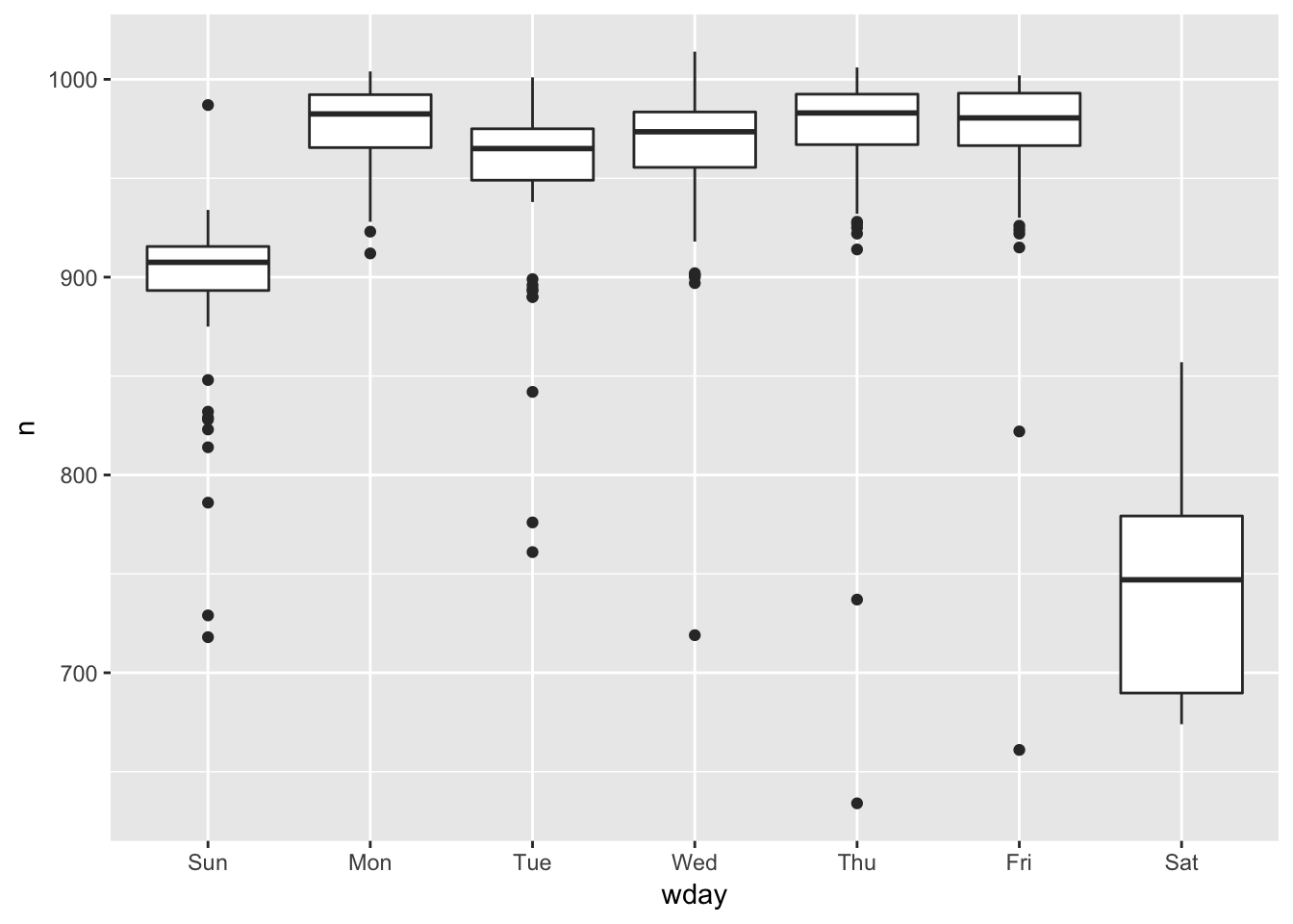
reorder_week <- function (mydata) {
  mydata <- factor(mydata, levels = c("Mon", "Tue", "Wed", "Thu", "Fri", "Sat", "Sun"))
  mydata
}

# after reordering the factors
daily %>% mutate (wday2 = reorder_week(wday)) %>% ggplot( aes(wday2, n)) +
  geom_boxplot()